
Engagement Survey Reporting: Manager Check-In
Perform Engagement Survey reporting is a powerful tool designed to revolutionize how managers leverage engagement survey data to drive organizational success. This reporting allows you to easily generate board-ready visuals of engagement survey data that provide insights into broad themes, top priorities, and trends over time.

Manager Check-In surveys are used to understand how your employees feel and monitor their engagement levels.
These will allow you to:
- Identify themes and top priorities
- Focus on specific survey questions to address concerns
- Track progress over time with trends
- See responses for individual employees or groups
Want to learn more? keep reading below!
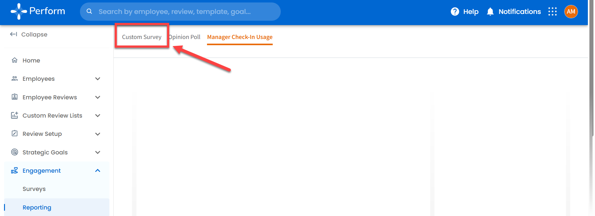
Accessing Engagement Reporting for Manager Check-In:
To access this reporting, navigate to the “Engagement” tab > “Reporting”.

Engagement Missing?
The Administrator of your Perform account might have disabled Engagement for Managers. If you do not see Engagement in the left-hand Panel, please reach out to your Administrator (often HR) to enable it.
Reporting Not Loading?
If this is your first time accessing a reporting dashboard, Perform will first need to build your account, which can take up to an hour. If after an hour, Engagement Reporting is not loading, please reach out to perform@trakstar.com.
Please note that currently, this will only display managers who have a completed survey or check-in only.
Sections of the Dashboard
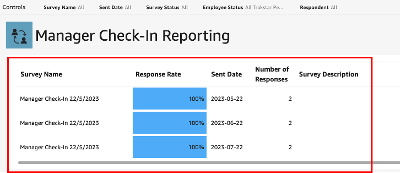
Survey Name, Description, Number of Responses and Response Rate
The Control Panel, highlighted in red in the screenshot below shows the surveys you've selected along with descriptions, how many responses were received, response rates, and the date when they were sent.
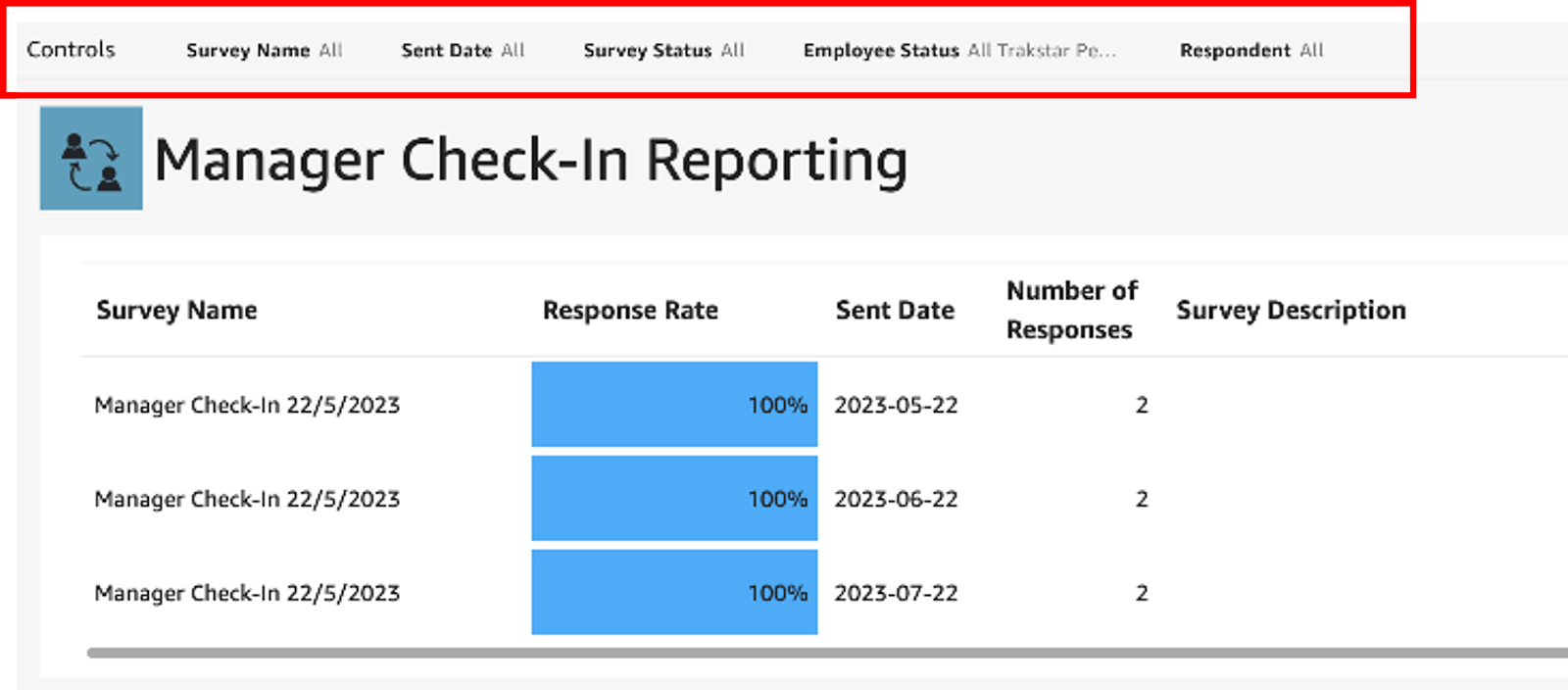
The details of the Manager Check-In Reporting, highlighted in the red box in the screenshot below will first list the names of the surveys sent under “Survey Name.” Response rate is calculated by dividing the number of responses received by the number of surveys sent out. If a survey was sent multiple times, you can see how response rates vary across different occurrences. The Number of Responses will also show, along with a Survey Description if one was listed. If you have sent out more than one Manager Check-In, this table will give you a quick visual to compare response rates.
Dashboard Filters
Our Dashboard Filters allow you to deep dive further into your data from your survey responses. Please note that adjusting any of the following filters will affect all data the Dashboard.
Survey Name
The Survey Name filter in the top left on the Dashboard allows you to choose from the list of Manager Check-In surveys you have sent out (see screenshot below). Note: If you have not sent out any surveys as a Manager Check-In this list will not populate.

The Sent Date filter allows you to view data from a specific survey Sent Date. For surveys sent multiple times, you can focus on a particular date or include all occurrences.
Sent Date
The Sent Date filter allows you to view data from a specific survey Sent Date. For surveys sent multiple times, you can focus on a particular date or include all occurrences.

If you pick just one date, visuals showing trends over time will have only one data point.
Survey Status
The Survey Status filter, located in the top center, lets you choose between Active, Archived, or All Aurveys (both Active and Archived).

Employee Status
The Employee Status filter, located at the top center, allowing you to choose between Active, Terminated, or All Trakstar Perform Users (both Active and Terminated).

The Employee Status filter is located at the top center and allows you to choose between active, terminated, or all users (both active and terminated). Keep in mind that this filter affects all parts of the dashboard.
Respondent
The Respondent filter will show data for your Direct Reports only. If you are a Manager of a Manager with Direct Reports, you will not be able to see those Subordinates.

The Respondent filter is a great tool that allows you to view data for specific employees or multiple employees. It's important to note that this filter has a global impact and affects all dashboard components.
Now, let's delve into more sections and explore them in detail!
Survey Score
This section of the dashboard focuses on rating-type questions exclusively.

The Survey Score table is calculated by averaging all the ratings and then converting them to a scale out of 100. For example, if a question has a five-point rating scale, selecting the highest option gives a score of 100, while selecting the lowest option gives a score of 20. For a five-level scale, the values would be 20, 40, 60, 80, and 100. For a four-point scale, it would be 25, 50, 75, and 100. And for a three-point scale, this would be 33.33, 66.67, and 100. The values are summed based on their value and then divided by the number of respondents to display the Average Score. This score enables you to compare across different rating scales and provides you with an overall view of employee engagement.
Only rating-type questions are assigned a score. Open-ended, text-only questions are not included.
To make it easier to identify, all areas related to survey or question scores are highlighted in light blue!
Average Score
This visual shows the average score for all rating-type survey questions in the selected survey.

Most Recent Score Trend
This Most Recent Score Trend will show the average survey score for the most recent survey sent. If you've selected multiple survey dates in the control panel, you'll see the second most recent score below the main one, along with the percentage change.
A number highlighted in red with a negative (-) symbol in front of it and a red down arrow indicates scores trending downward. A number highlighted in green and green up arrow indicates scores trending upward.
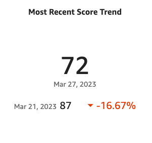
This visual makes it easy to see if the average score is going up or down compared to the previous data point.
Score Over Time
The Score Over Time shows how the average survey scores change over time. Each survey sent date is marked with a data point on the line. Hover over the line, and you'll see a tooltip with details of the survey name and average survey score.

Average Question Score by Question
The Average Question Score by Question compares average scores between different questions, allowing Managers to identify high or low scores. Each question asked will display the Average Score from respondents from the survey(s) that have been selected. Only average scores from questions containing data will be displayed in blue. If there is no data from a specific question the bar will be blank. Survey questions are numbered, therefore repeated numerical values or repeated questions could be displayed if you have selected multiple surveys to compare data

Rating Question Detail
The Rating Question Detail section of the dashboard will display data for rating-type questions. It will provide detailed information for each survey question. In this section of the dashboard, you'll find data for rating-type questions. It provides detailed information for each survey question.

Filters Specific to the Rating Question Detail Section
The Rating Question Detail allows for focus on data for a specific survey question. When you first open or reset the dashboard, you'll see the message "Select a question from the dropdown list." When you choose a survey question, the dashboard will update with data specific to that question.
Note: the dropdown only includes survey questions related to ratings.

Rating Question Response Distribution Horizontal Bar Chart
This visual shows how survey responses are distributed among different response options. The options are listed in the same order as they appeared on the survey. Hover over any bar in the chart to see how many responses it represents.
Pro-Tip: if you click on a bar, the table below will only show comments related to that response. This helps you understand the “why” behind respondents choosing that particular option.
This visual helps you see if a survey question got a mix of responses or if most people leaned towards one option. It's a handy way to explore your survey data!

Most Recent Average Score for This Question
The Most Recent Average Score for this Question will display the average score of the question you have selected. If you have picked more than one survey date, you will see the second most recent score below the main score. In the bottom right-hand corner you will either see numbers displayed in green or red, indicating percentage change between the survey dates. Red font, with a red down arrow, indicates a negative change in the score; whereas, green font, with a green up arrow, indicates a positive change in score. This data helps identify trends over time.

Question Score Over Time Line Chart
To see trends for a specific question over time, the Question Score Over Time Line will display those trendlines. Each point on the line indicates a survey date, with a blue line as your trendline for that data. Hover over the line, and you'll see details for that survey date

Question Comments Table
If Comments were included as Optional or Required in your Check-In, the Question Comments Table will display those comments next to the question asked, the rating/response, and the date the survey was sent. If you click on a specific response bar in the chart above the table, it filters the table to only show comments related to that response. If there aren't any comments for a question, this section will remain empty.

Let's move on to the next part of the dashboard!
Open Comment Question Detail
This visual shows data from comment-only survey questions. The table organizes the comment responses by Survey Name and Survey Question. You can collapse or expand the survey name and question levels by clicking on the + and - buttons to the left of the text.
Here's an example of how it looks:

You can also export this table as a CSV or Excel file to analyze survey data outside of the dashboard.
All Survey Data and Comments
This visual displays the available surveys. The columns are:
- Respondent - Shows the survey respondent's name or ID in anonymized surveys.
- Survey Name - Shows the survey name.
- Survey Sent - Shows the date when the survey was sent.
- Response Date - Displays the most recent revision date for revised responses or the submission date for initial responses.
- Survey Question - Shows the specific survey question.
- Rating Response - Shows the rating for the question. For open comment questions, this field is blank.
- Further Comments - Displays additional comments from the respondent.

You can also export this table as a CSV or Excel file to analyze survey data outside of the dashboard.
Managers with No Check-ins
Find more features below!
Print Capabilities
The Dashboard, with the exception of the full scoreable table, can be printed via your local printer, or by selecting "print to PDF" to save the file directly to your computer in PDF format.
Export Capabilities
To use or view specific data in Excel or CSV file, hover your mouse near the top right corner and click the three dots. A pop-up menu will appear allowing you to export the tables in CSV or Excel form.

Filtering Capabilities

The Control Panel is always at the top of the dashboard. Expand or collapse by clicking the arrow in the top right corner.

If the survey is anonymized, these filters will only show options where there are five or more survey responses. This is to keep the respondents' data confidential.
Questions? We're here to help! Reach out to us at perform@trakstar.com!