
Engagement Survey Reporting - Opinion and Custom Surveys
Perform Engagement Survey Reporting is a powerful tool designed to revolutionize how managers leverage engagement survey data to drive organizational success. This reporting allows you to easily generate board-ready visuals of engagement survey data that provide insights into broad themes, top priorities, and trends over time.
Opinion surveys were replaced in May 2024 with the new eNPS survey type. It is no longer possible to create new Opinion surveys, but existing Opinion surveys and their reporting dashboards are unchanged.

This article will provide you with helpful tips on how to understand and use the information from engagement survey reporting.
With these visuals, you can:
- Identify themes and top priorities
- Track average survey score trends
- Compare departments and manager groups to see who needs support
- Monitor survey response trends
- Benchmark your surveys against other surveys
- Get results from surveys you didn't directly send
- Dive into specific survey questions.
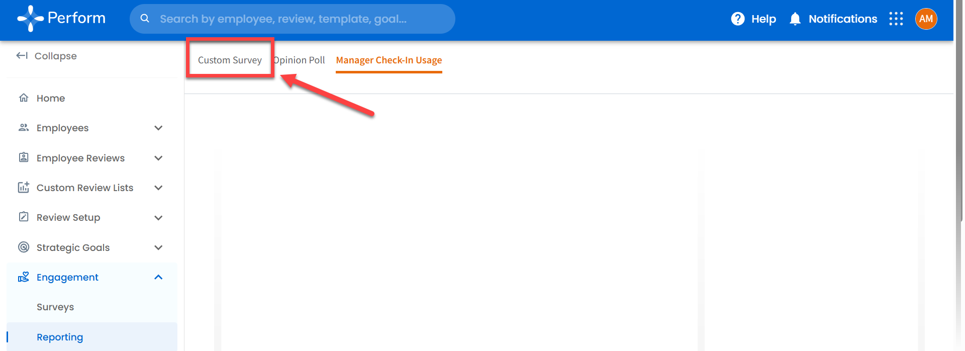
Accessing Engagement Reporting
To access this reporting, navigate to the “Engagement” tab > “Reporting”.
Engagement Missing?
The Administrator of your Perform account might have disabled Engagement for Managers. If you do not see Engagement in the left-hand Panel, please reach out to your Administrator (often HR) to enable it.
If you are an Administrator and not seeing Engagement as a feature, please reach out to perform@trakstar.com to help.
Reporting Not Loading?
If this is your first time accessing a reporting dashboard, Perform will first need to build your account, which can take up to an hour. If after an hour, Engagement Reporting is not loading, please reach out to perform@trakstar.com.
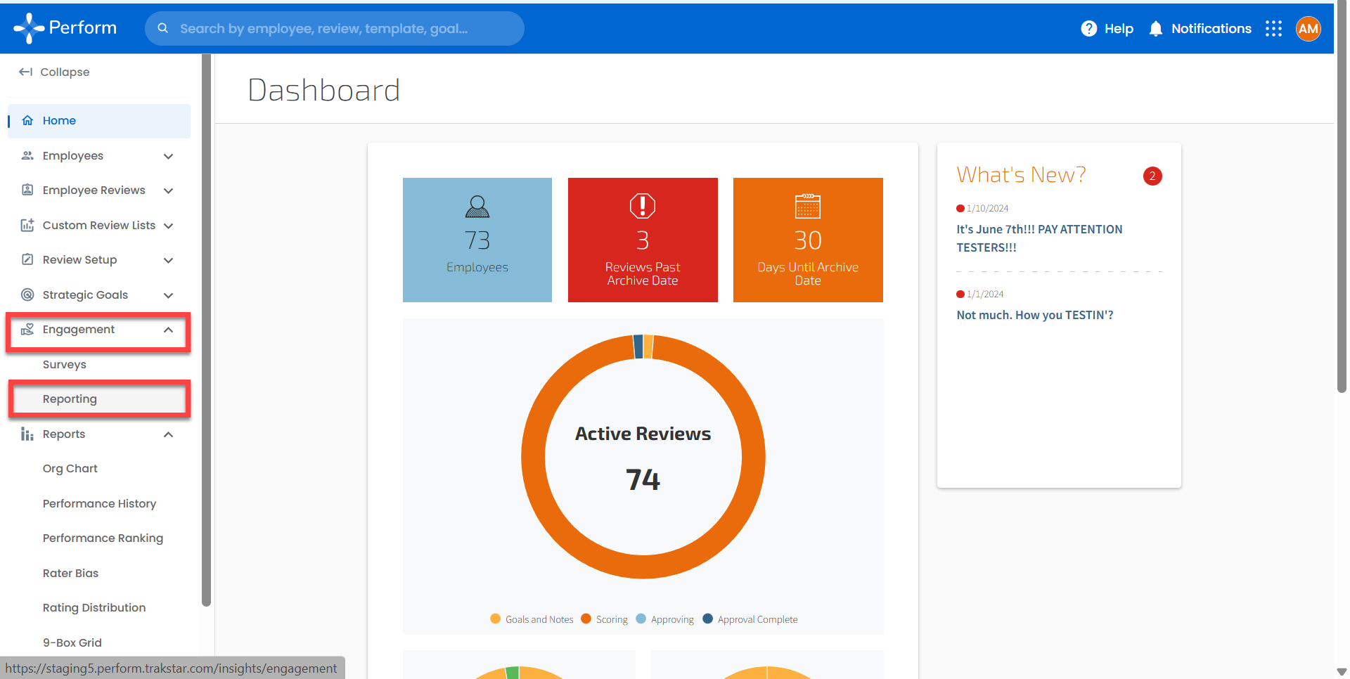
Sections of the Dashboard
Survey Name and Survey Description
This table displays which survey(s) have been chosen in the control panel, as well as their description. This is the only section where you can find the survey description. If the selection includes anonymous surveys, a red text notification will appear in the top right corner.
We've tailored the dashboard to protect instances where fewer than five responses are submitted for an anonymous survey. As a result, the control panel filters will not display categories with fewer than five responses.
Response Rate and Response Time Metrics
The dark blue banner at the top of the dashboard allows you to keep track of the survey response rate and response time. These metrics provide valuable insights into how well the survey deployment has performed. You can easily see if the survey has generated the expected level of response and also how long it took users to respond.

Response Rate
The Average Response Rate of your selected data illustrates the level of engagement from your audience.
In the lower-left corner, you'll find the average response rate for similar surveys, both Custom and Opinion. This figure is derived from combining all the Trakstar Perform surveys within that category that have reached their cut-off date.
This overall average response rate offers a broader perspective, helping you gauge the performance of your survey.
Total Responses
This visual calculates the response rate by dividing the number of survey responses by the number of surveys sent.
Average Days Between Survey Launch and Response
This visualization displays the average number of days it took for survey respondents to submit their feedback. This helps you understand the turnaround time for feedback and how prompt your audience is in responding.
Tip: If the survey was submitted on the same day it was sent, the number of days is recorded as zero. Data is refreshed daily, so it may be a day delayed
Response Rate and Time by Sent Date
This table presents a comparative overview of the Response Rate, Number of Responses, Surveys Sent, and Average Response Time (in days). It is arranged by the Survey Sent Date so you can easily track how things are going over time.
If a survey was sent out more than once, this table allows you to compare how each occurrence performed and the timing of responses. If you have selected multiple surveys in the control panel, this table neatly organizes the metrics by the sent date for each of your chosen surveys.
It's your go-to for tracking performance and timing at a glance!
Let's move on to the next part of the dashboard!

Survey Score
The Survey Score is where you can find data on questions that were tied to a rating scale. It is designed to show a survey score that is calculated by averaging all the responses on the rating scale. The Range of the Rating Scale is 0 to 100.
For example, if a question has a five-point rating scale, selecting the highest rating will give you a score of 100. On the other hand, selecting the lowest rating will give you a score of 20.
Only rating-type questions contribute to the survey score, so text-only questions are not included. This feature allows you to quickly measure employee engagement across different rating scales.
All sections related to survey and question scores on the dashboard, like this one and the Rating Question Detail section, are highlighted in light blue.
Average Score
This visualization shows the average score for all rating-type survey questions in the selected survey(s).

Most Recent Score Trend
This displays the average survey score for the most recent survey sent date. If you have chosen multiple survey dates in the control panel, it will also show the average survey score for the second most recent date. Additionally, it informs you whether there has been a percentage increase or decrease in the score compared to the previous data point.
In simpler terms, it helps you see if the average survey score is currently trending upwards or downwards compared to the previous data point.

Average Score for All Trakstar Perform Users
The bar chart below is your Average Survey Score. If you use the Employee Grouping filter in the control panel, the chart will transform to compare data across different groups. Additionally, the chart's title adjusts automatically to reflect the group you've selected.


With this feature, easily compare average survey scores among different groups. It helps spot trends and identify which groups are scoring higher or lower.
Heads up: Employee Grouping includes all the groups you've defined, along with options such as Employee Tenure, Manager Name, and Performance Band. If you don't see a particular option, it might be because it's an anonymous survey and the mandatory five responses have not been recorded yet.
Score Over Time
This graphic displays the average survey score variations over time. Each point on the line represents the date when a survey was sent. When you hover over a point, a tooltip appears with information such as the date of the survey, the survey name, and the average score. It's like taking a trip through your survey scores over time, allowing you to quickly detect any trends or changes.

Average Question Score for All Trakstar Perform Users
This visual shows the average score for each rating-type question on the surveys you've selected. It uses a heat map, where the darker the color, the higher the score, with lighter shades indicate lower scores. A gray color will indicate no data collected for a question.
Keep in mind that if you've chosen multiple surveys, you might see repeated questions if they were included in multiple surveys.
Similar to the Average Score for all Trakstar Perform Users, if you use the Employee Grouping filter, the heat map changes to compare data across different groups and the chart title will update to match your selection.
This visual is your trusty guide for comparing average scores between questions and groups. It helps you spot areas that are doing well or might need some attention, and the heat map layout makes it easy to spot broader patterns in the data. For example, if you notice rows or columns with lighter or darker colors, you may want to take a closer look at those questions, as they are outliers with exceptionally high or low scores.

Let's move on to the next part of the dashboard!
Rating Question Detail
This section of the dashboard displays data for rating-type questions only. It is your personal hub for exploring each survey question in detail.

Filters Specific to the Rating Question Detail Section
This dropdown filter allows you to choose a specific survey question to focus on. When you first open the dashboard or reset it, the dropdown will display "Select a question from the dropdown list." You will not see any visuals in this section until you select a question. Also, please note that only survey questions of the rating type will be listed in the dropdown.

Rating Question Response Distribution Horizontal Bar Chart
This shows how survey responses are distributed. Options are listed in the same order as they appear in the survey. Hovering over a specific bar displays a tooltip with the response count.
If you click on a bar in the chart, the table below in the Rating Question Detail section shows only the comments related to that particular response. This is a shortcut to understanding why people may have chosen a certain option.
This chart helps you spot if a question sparked a mix of responses or if one option was more popular. With the action filter, you can dive deeper into the reasons behind those choices by reading the associated comments.

Most Recent Average Score for This Question KPI
This shows the average score for the question you have chosen. If you have selected multiple survey dates, it will also display the second most recent average score below the latest one. It also provides the percentage increase or decrease in score.
This is a quick snapshot of how the average score has changed compared to the previous data point.

Question Score Over Time Line Chart
This graph shows how a question’s score changes over time. Each survey date is marked with a point on the line. When you hover over a point, you'll see specific data for the survey sent on that date.
This visual helps you track how the question score has evolved over time, as well as how frequently this survey question has been asked.

Question Comments Tables
This table shows any additional comments that people submitted along with rating-type questions. The table lists the chosen rating response, any comments that were added, and the date the survey was sent.
Here's a notable feature: if you click on a bar in the horizontal bar chart, the table focuses only on comments related to that response. If there aren't any additional comments for a question, this section will remain empty.
This is a backstage pass to understanding more about survey responses and the “why” behind people selecting certain ratings.

Open Comment Question Detail
This table neatly organizes the comment responses under each survey name and survey question. You can expand or collapse the survey name and question levels by clicking on the "+" and "-" symbols to the left of the text.
You can also export this table as a CSV or Excel file. That way, you can delve deeper into the survey data and conduct your analysis outside of the dashboard.

All Survey Data and Comments
This visual shows you all the surveys available for you to explore. Let me break it down for you:
- Respondent - Survey respondent's name or ID.Please note that anonymized surveys will only display the survey respondent’s ID.
- Survey Name - Name of the survey.
- Survey Sent - Date when the survey was sent.
- Response Date - Date of the survey response submission.
- Survey Question - Specific question on the survey.
- Rating Response - Rating provided for the survey question. This will be blank if it's an open comment type question.
- Further Comments - Additional comments left by the respondent.
Once again, if fewer than five survey responses are given for an anonymous survey, they will be hidden from the dashboard display.
Users have the option to export this table as a CSV or Excel file and analyze the survey data outside of the dashboard.

Find more features below!
Print Capabilities
The Dashboard, with the exception of the full scoreable table, is ready for you to print using your local printer, or by selecting "print to PDF" to save the file directly to your computer in PDF format.
Export Capabilities
Users have the option to export this table as a CSV or Excel file and analyze the survey data outside of the dashboard.
To use or view specific data in Excel or CSV file, hover your mouse near the top right corner and click the three dots. A pop-up menu will appear allowing you to export the tables in CSV or Excel form.

Filtering Capabilities

The Control Panel is always at the top of the dashboard. You can expand or collapse it by clicking the arrow in the top right corner.

If a survey is anonymized, these filters will only show options where there are five or more survey responses. This is to keep the respondents' data confidential.
Survey Name

The Survey Name filter is located at the top left and it allows you to choose from a list of surveys that belong to you. You can select one survey or multiple surveys. Keep in mind, this filter affects all parts of the dashboard.
Sent Date

The Sent Date filter allows you to select data based on a specific date of sending. For surveys sent out multiple times, you can either focus on a specific date or include all occurrences. If you choose only one date, visuals showing trends over time will display just one data point. Keep in mind, this filter affects all parts of the dashboard.
Survey Status

The Survey Status filter, located at the top center) enables you to select between active, archived, or all surveys (both active and archived). Keep in mind, this filter affects all parts of the dashboard.
Employee Status

The Employee Status filter is located at the top center and allows you to choose between active, terminated, or all users (both active and terminated). Keep in mind that this filter affects all parts of the dashboard.
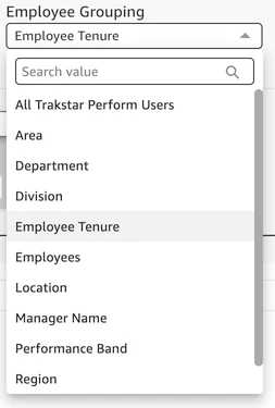
Employee Grouping and Employee Grouping Detail
The Employee Grouping and Employee Grouping Detail filters work together to help you select specific groups of survey respondents.
The Employee Grouping filter includes all kinds of groups such as Employee Tenure, Manager Name, and Performance Band. You might recognize these categories from Perform Benchmarking dashboards. If you choose "All Trakstar Perform Users," you'll see all users who took the survey.
Groups will populate and display based on the Groups you have set up for Employees under Settings > Groups in the Admin Panel. The screenshot below includes Groups such as Area, Department, Division, etc that have been established for users. For more information on how to Manage Groups, we recommend this Support Article: Managing Groups.
The Employee Grouping Detail filter lets you narrow down your selection into more detail.. For example, under the Performance Band Grouping, you might see options like Bottom 10th Percentile, Middle 80th Percentile, Top 10th Percentile, and No Performance Band Assigned. This will allow you to narrow down responses based upon an employee’s performance - you can see responses from only your top 10% of performers or your bottom 10% of performers.
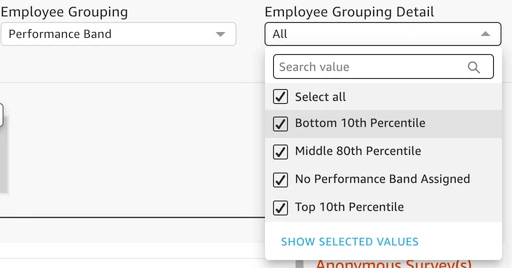
If you select multiple Employee Grouping Detail categories, they'll show up as multiple bars in the bar chart and as multiple columns in the heat map.
Important Note: If you don't see a particular option, it might be because the survey is anonymized and there are fewer than five responses.
Questions? We're here to help! Reach out to us at perform@trakstar.com!